In June 2015, Taste of Belgium opened their third location in Cincinnati, OH. Jean-Francois Flechet hired Betty Bone Designs to bring the brand to life in a new, more upscale location. The design focused on launching a touch of Belgium into the space in new and surprising ways. BBD's first task was to separate spaces with wall color to create areas of intimacy.
The main three entry walls were primed for artwork and are the most prominent visual within the space. Betty Bone Designs suggested bringing motion graphics to life within those spaces. Through her connections Taste of Belgium brought in Steve McGowan and Dan Reynolds from Brave Berlin to do the motion graphic work. The concept was to create multiple frames in the three wall areas and Harry Potter them out. This means that after installing the frames, Chris Glenn animated across all of them so that they interact with one another.
The second area of focus is an ode to the waffle. This space really brings to life the idea of Live like a Belgian, Eat Like a Belgian and Drink Like a Belgian. These are brand fundamentals that are displayed as typographic banners in other Taste of Belgian locations. In this location, BBD decided to showcase the iconic waffle shape and feature imagery of those three ideas.
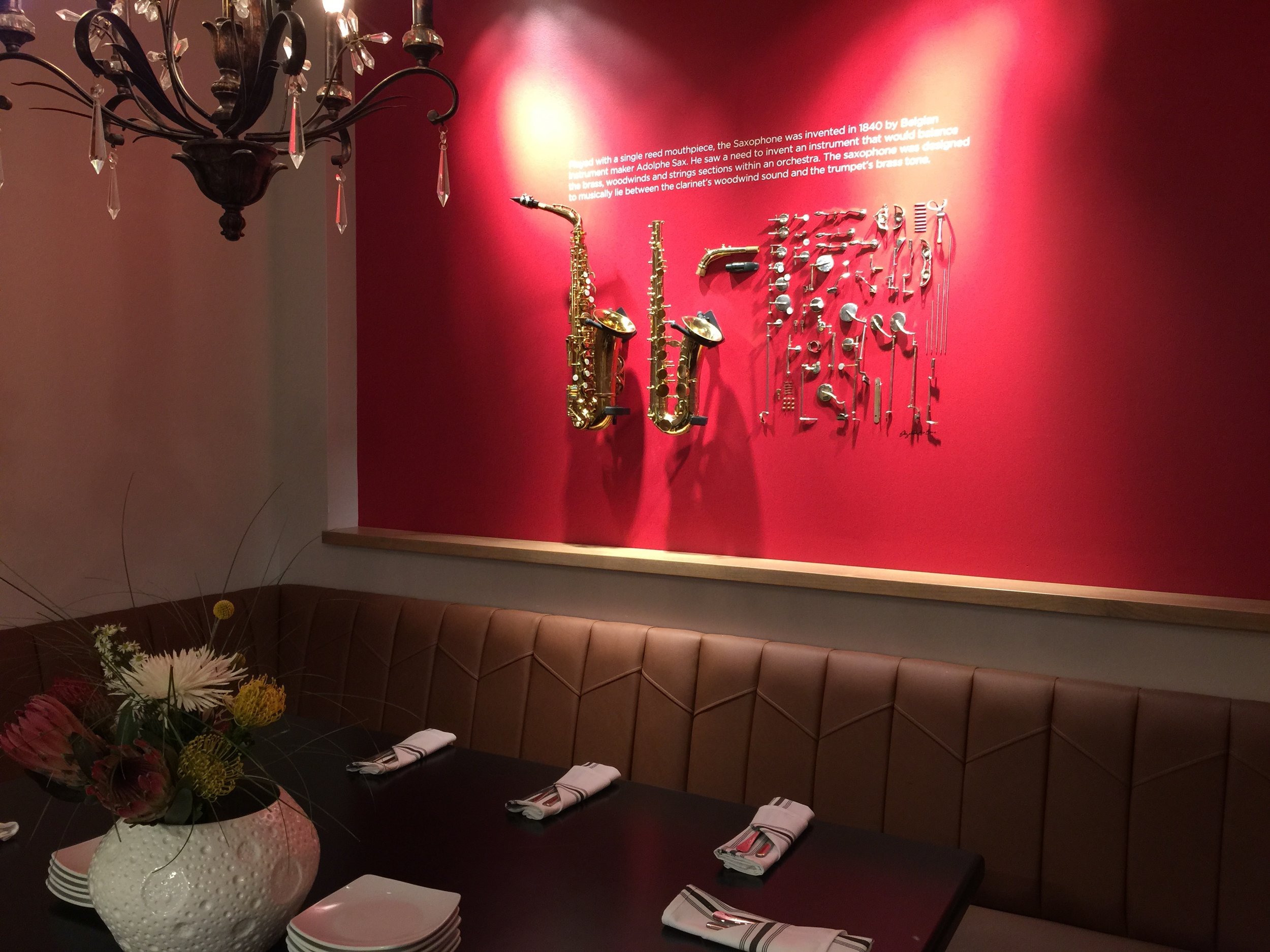
The third space is an intimate private party area. The drama of the red wall is the perfect setting to highlight one of Belgium’s great inventions: The Saxophone. Highlighting the saxophone in a fresh inspiring way, BBD deconstructed one saxophone and displayed two others creating a beautiful composition. The saxophone gold highlight to the red that pulls from the soft yellow of the walls into the rest of the space. It's a great conversation piece for everyone who enters the space.
The last large area is a private dinning area that is slightly closed off from the rest of the space. It holds large parties and business meetings. In this space, BBD brought to life the food that Taste of Belgium is known for. It is inspired by Belgian artist René Magritte's Son of Man image. BBD contemporized the suit and space, and used the beautiful food photography of Allison McAdams.
The rest of the space and elements really are about making sure everything holds together as a brand. The comprehensive design of the restaurant uses the colors, typography, and Fork and Crown Logo in fresh and beautiful ways for the Cincinnati Hyde Park audience.


