Connection and responsibility
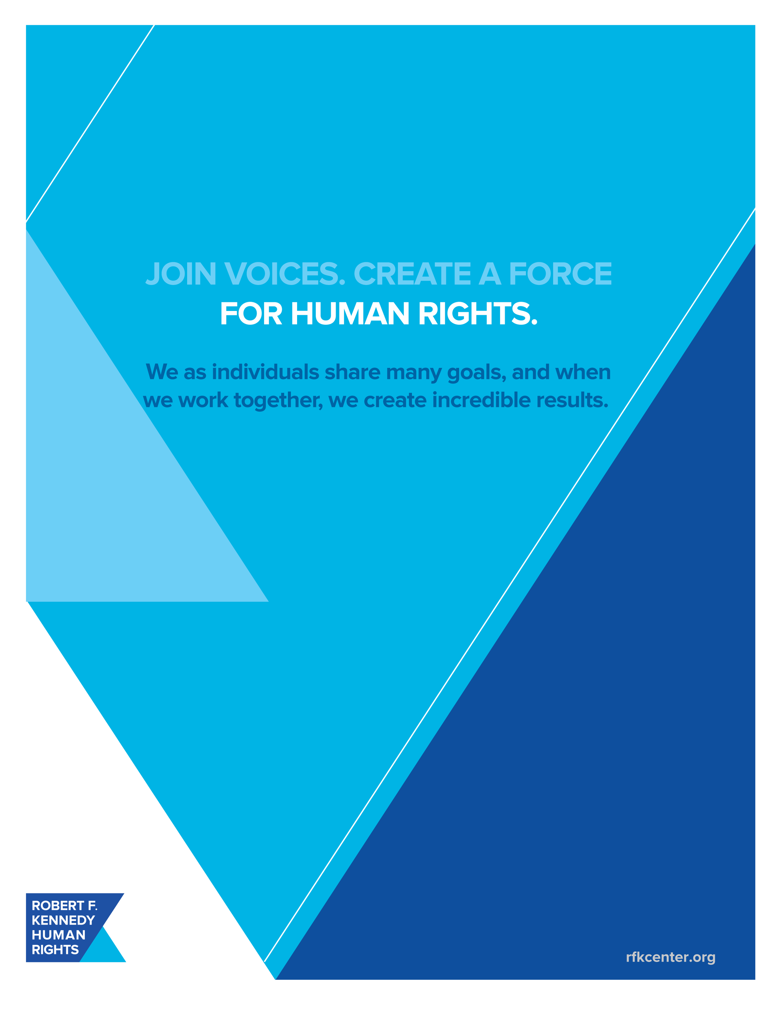
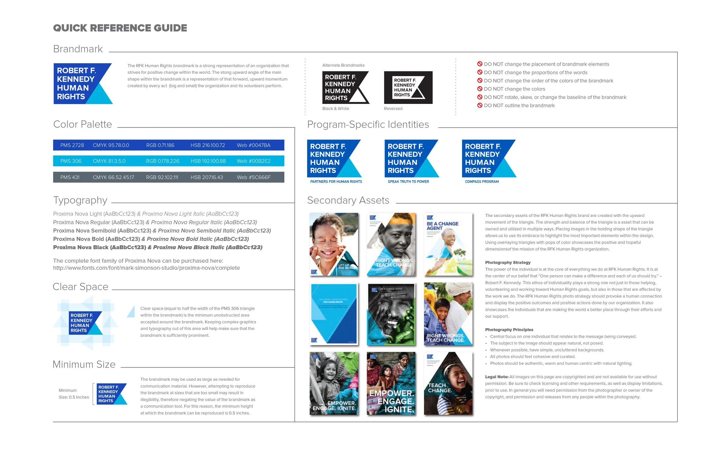
Robert F. Kennedy Human Right's was looking to update their brand identity with something bold and iconic. They wanted to somehow incorporate the "K" from Kennedy to capitalize on the name recognition. This design was in keeping with that as a fundamental element. The brand mark is marked by the dramatic upward angle of the "K" representing growth and positive momentum.
The Triangle
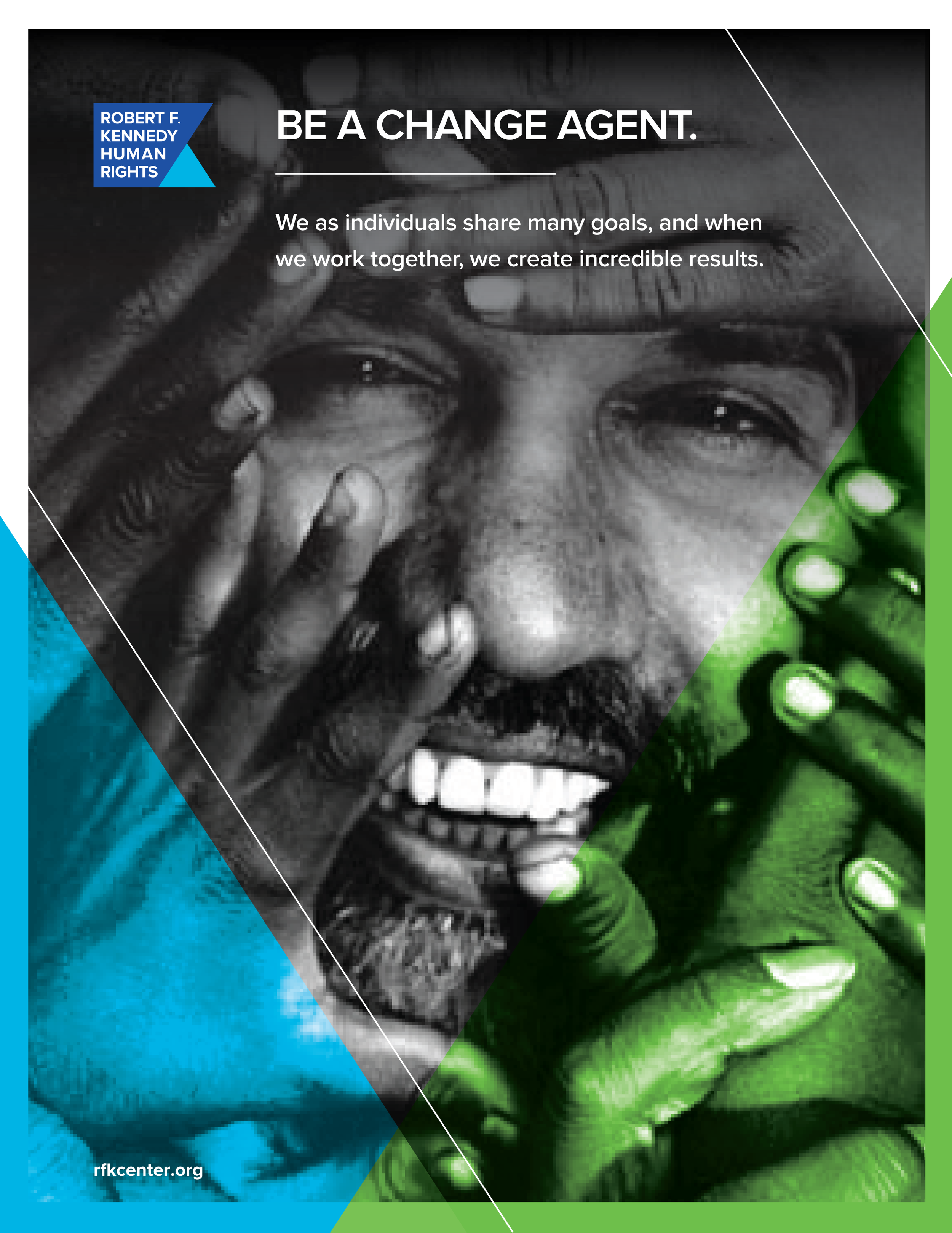
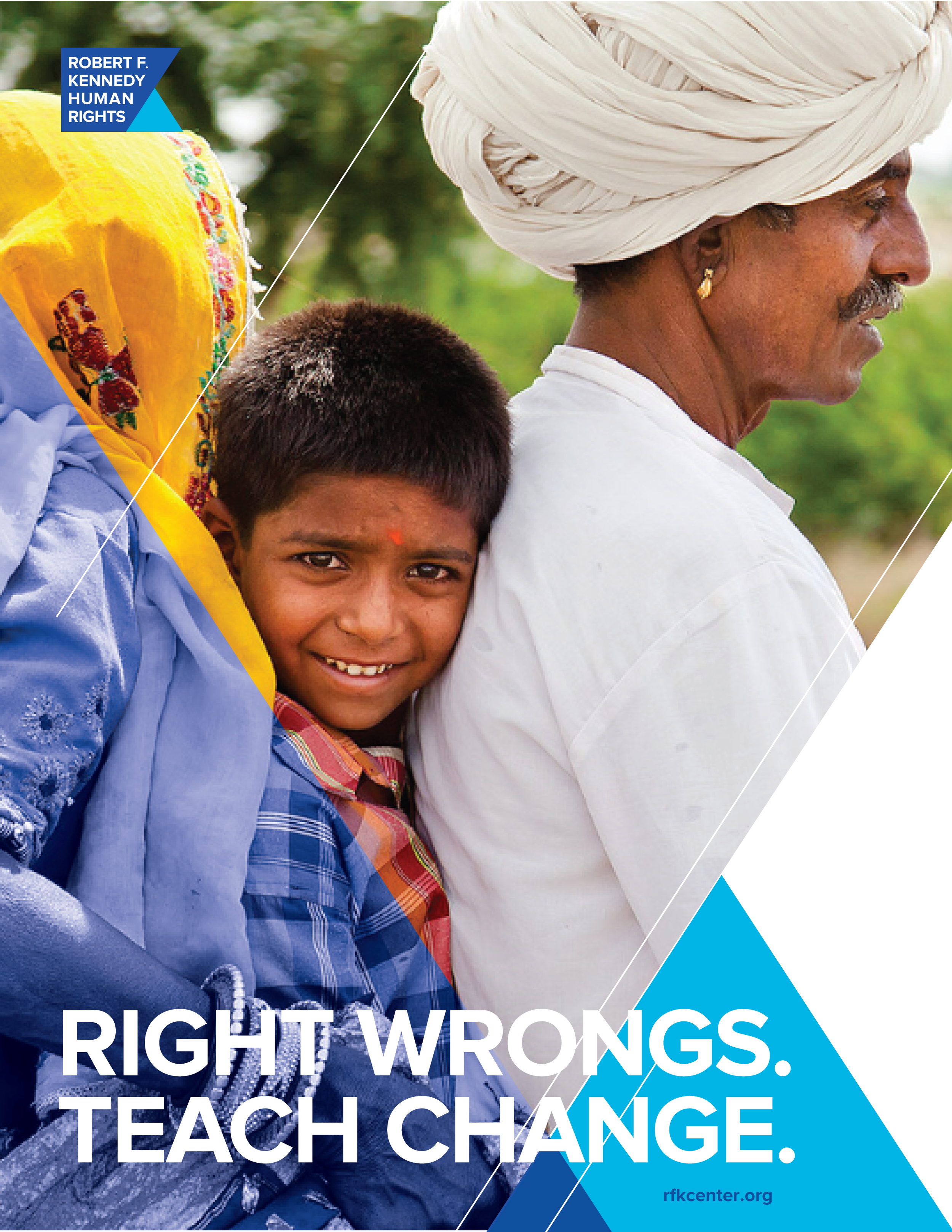
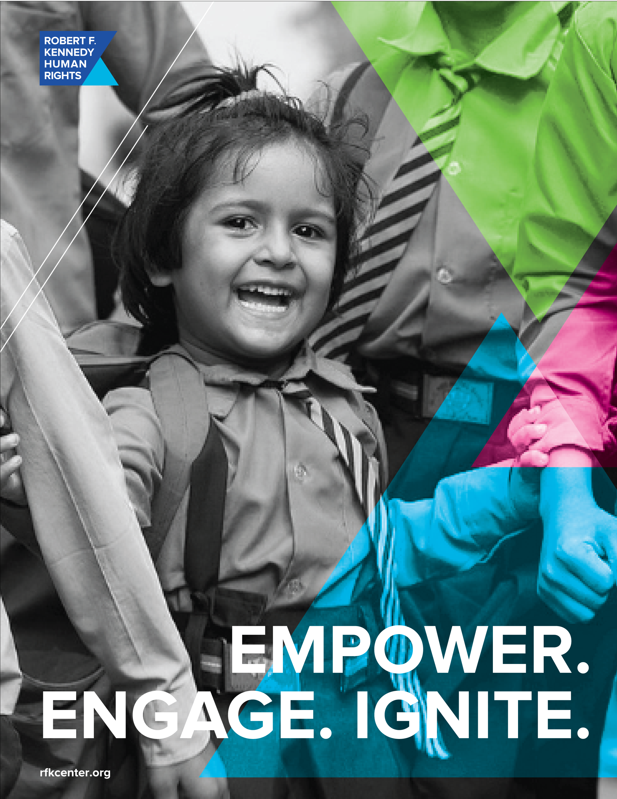
By using the equilateral triangle that acts as the fulcrum in the brand mark as a super graphic and pattern element we create a balanced and dynamic graphic system.
TRANSPARENCY
The use of transparency helps to connect photography from multiple photographers and multiple global locations while expressing the intent of RFK Human Rights to be transparent about their goals and actions.
